

ArcValidator Redesign
Simplifying an industrial verification workflow
Role: UX/UI Trainee — Concept & Interaction
Context: Industrial validation device · professional tool
Core problem: Slow verification and button-heavy navigation
Outcome: 8 screens → 5 steps · Fewer presses · clearer feedback
Duration: Mar–Jun 2025 · Oct–Dec 2025
Some screens are anonymised or blurred due to NDA.
Only selected parts of the process are shown.
QUICK OVERVIEW
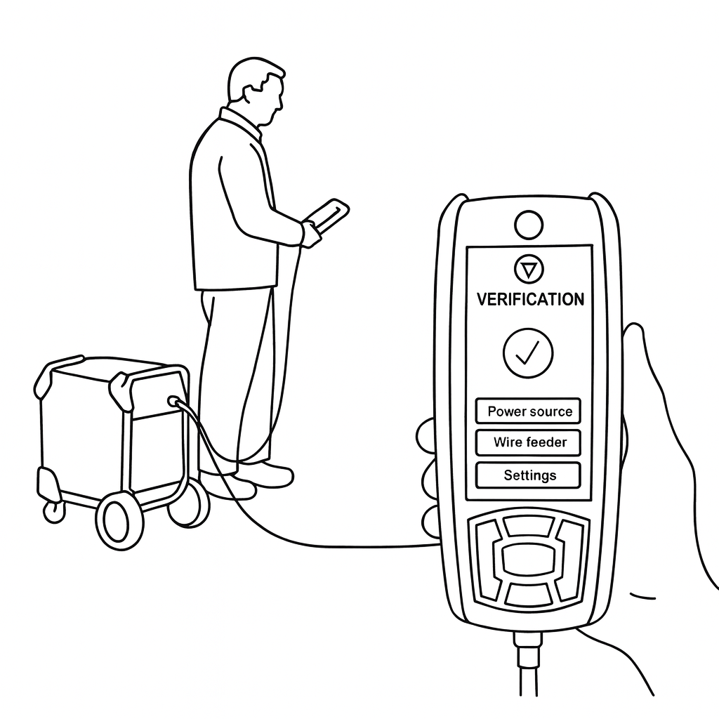
Validator is a handheld industrial verification device used by service technicians to validate welding equipment and document results in the field.
This case focuses on one core verification flow, selected from a broader redesign project.
STARTING POINT
Before redesigning, I mapped the current verification workflow and how technicians use the device in the field.
A routine verification took 8 separate screens, making the flow slow and button-heavy.
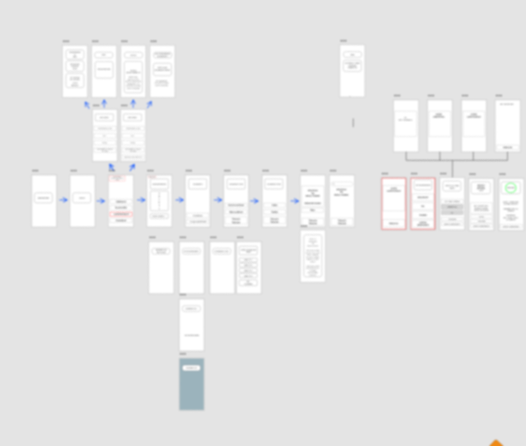
CURRENT FLOW
Current verification flow mapped from the existing UI and field use.
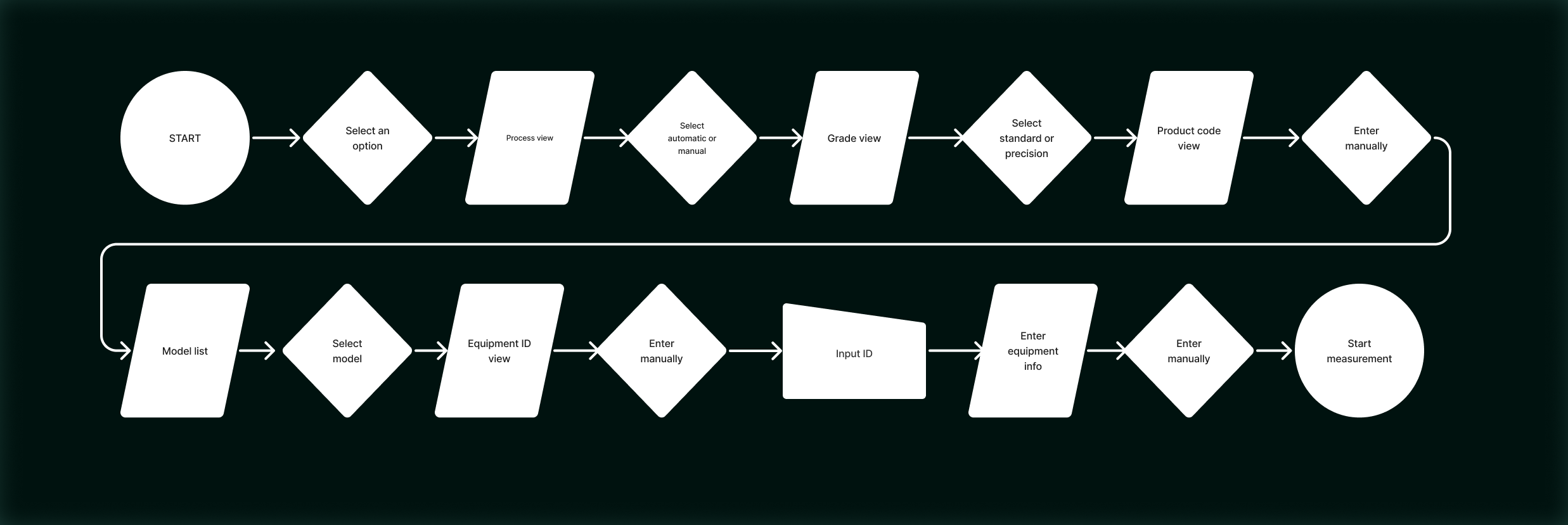
8 screens for one routine task
Multiple manual inputs
Button-heavy interaction for common actions
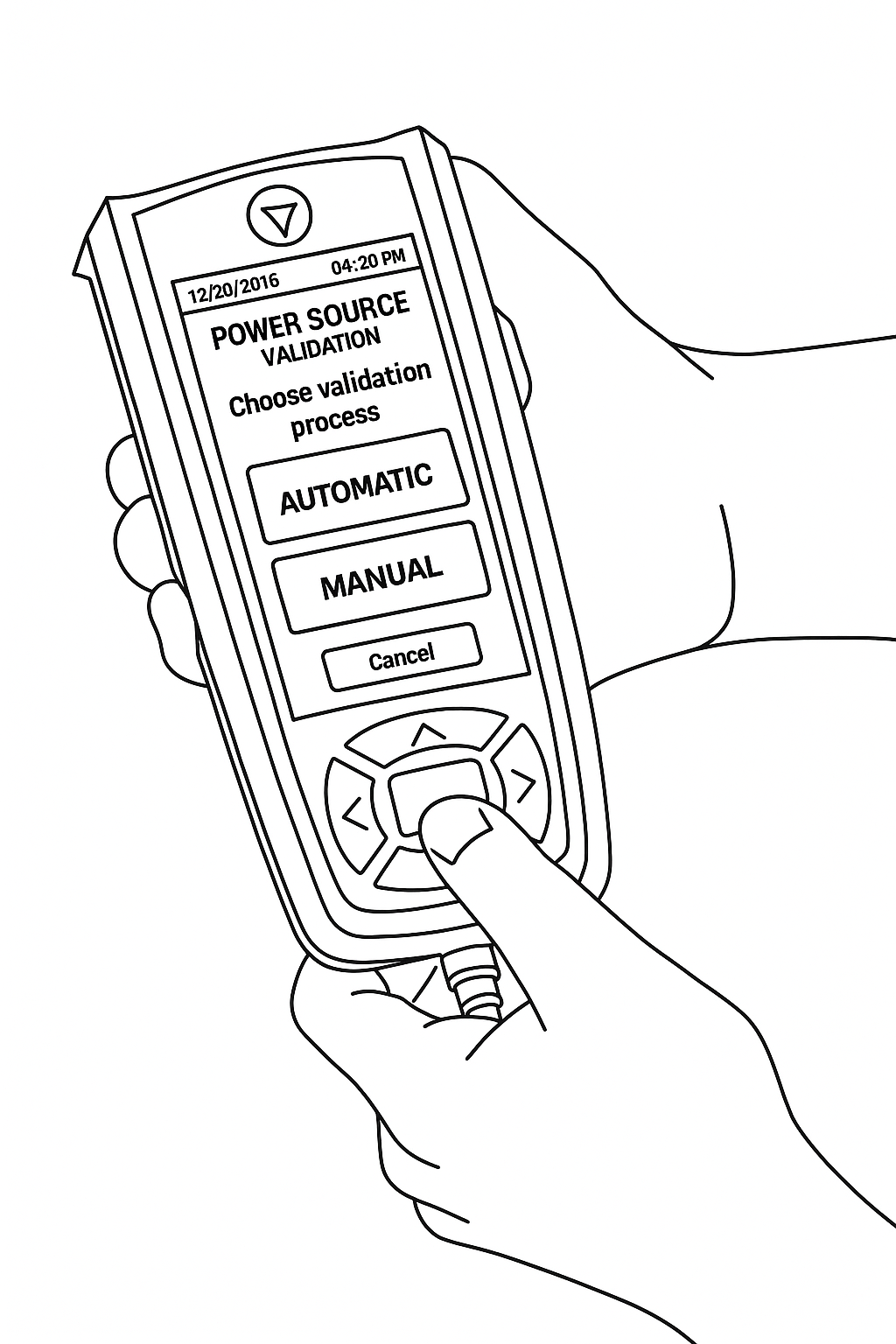
Screens from the current verification sequence
UNDERSTANDING THE USERS
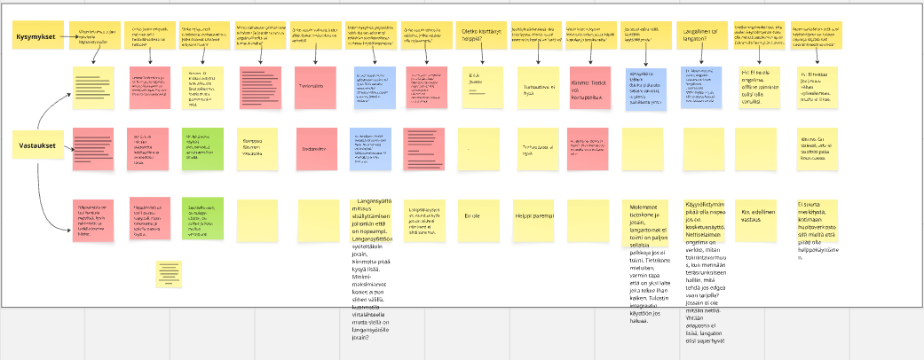
I interviewed service and maintenance technicians and Kemppi stakeholders to understand how verification is carried out in real field conditions.
Interviews produced raw notes, captured in Miro and grouped into problems, needs, positives, and open questions.
Raw interview notes in Miro → grouped into themes.
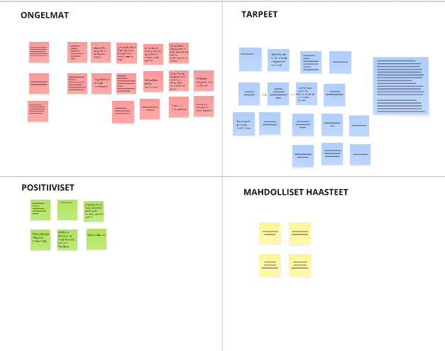
KEY INSIGHTS - PAIN POINTS AND NEEDS
From the interviews and mapping work, a few recurring pain points and needs became clear.
Button navigation is slow — one wrong press can mean backtracking through several screens
The UI feels inconsistent — the same actions appear in different places
Changing parameters takes too many steps — routine tasks become “button-heavy”
PAIN POINTS
Capture customer details early — so they don’t need to be remembered at the end
More direct on-screen control — less scrolling through options with buttons
Clear system status — show when the device is loading/sending so it doesn’t feel frozen
NEEDS
How might we help technicians complete verification faster with fewer button presses and clearer next steps?
DESIGN PRINCIPLES FOR THE NEW FLOW
Clarity first
Plain language + clear next step.
→ Each screen answers: Where am I? What’s next?
Fewer button presses
Remove backtracking and repeated selections.
→ Common actions reachable in 1–2 presses.
Work in one place
Keep key inputs + verification status together.
→ Less jumping between screens to finish a routine task.
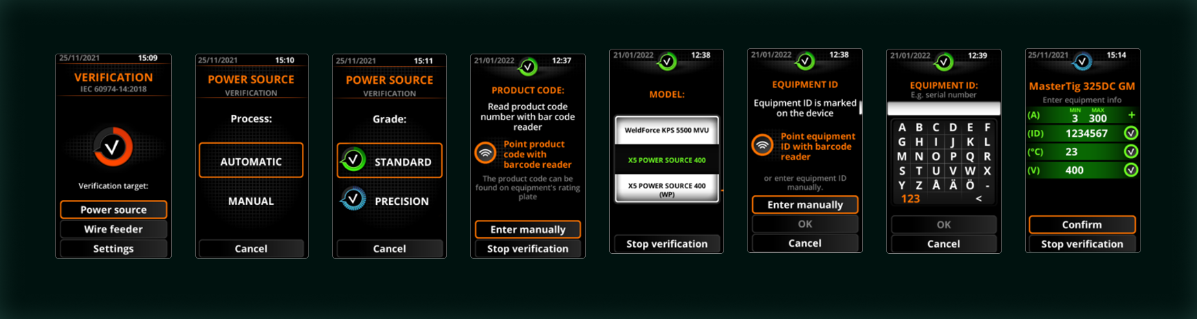
NEW FLOW
Proposed verification flow after redesign.
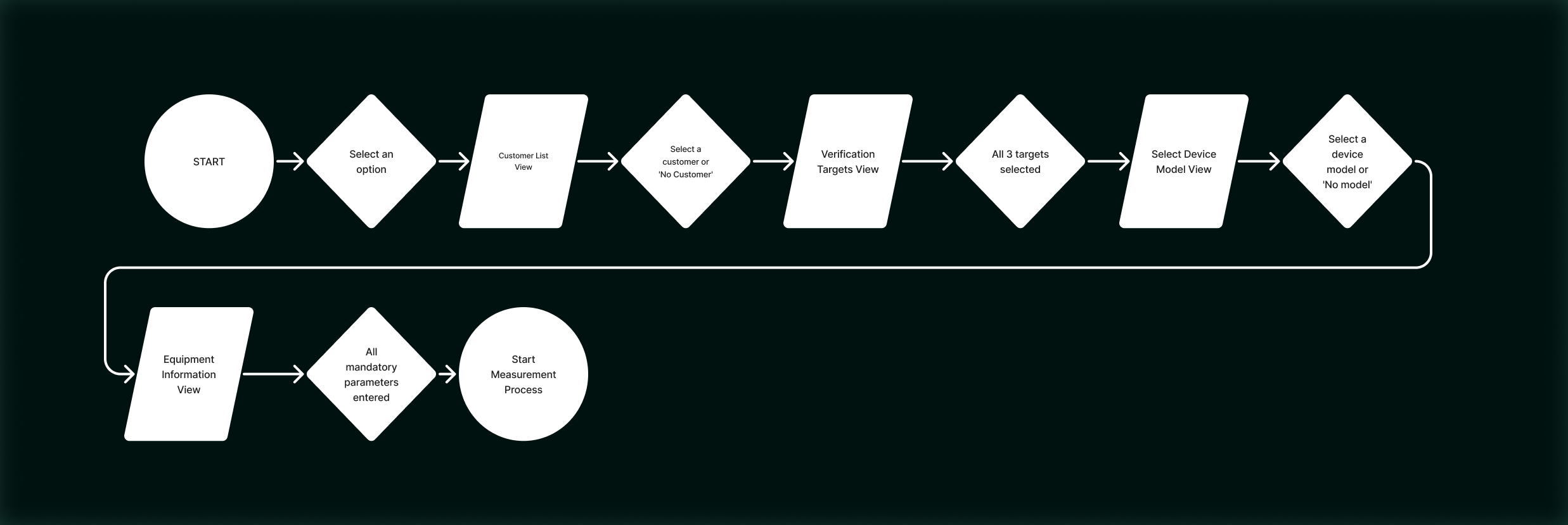
Result:
Reduced the core verification flow from 8 screens to 5 steps (3 fewer screens).
Less navigation and manual input during a routine verification.
Some interaction and layout improvements are not shown due to NDA.
Screens from the new verification sequence (anonymised).

DESIGN ITERATIONS & DECISIONS
The 5-step flow was shaped over several review rounds with the UX team and stakeholders. The focus was to reduce unnecessary steps and make the verification easier to complete.
Flow decisions
I started by clarifying the existing 8-screen flow. Through recurring reviews, overlapping steps were merged and unnecessary pauses removed, resulting in a core verification flow with 5 guided steps.
Discarded concepts
A card-based selection layout was explored, but it didn’t fit the chosen UI direction for this product. A “nearest site” map view was also explored and later parked due to uncertainty around future platform and GPS support.
Design system alignment
Later iterations aligned the UI with Kemppi’s design system: pill-shaped buttons, tighter labels and step titles, and spacing and contrast adjustments to keep key actions clear in field use.
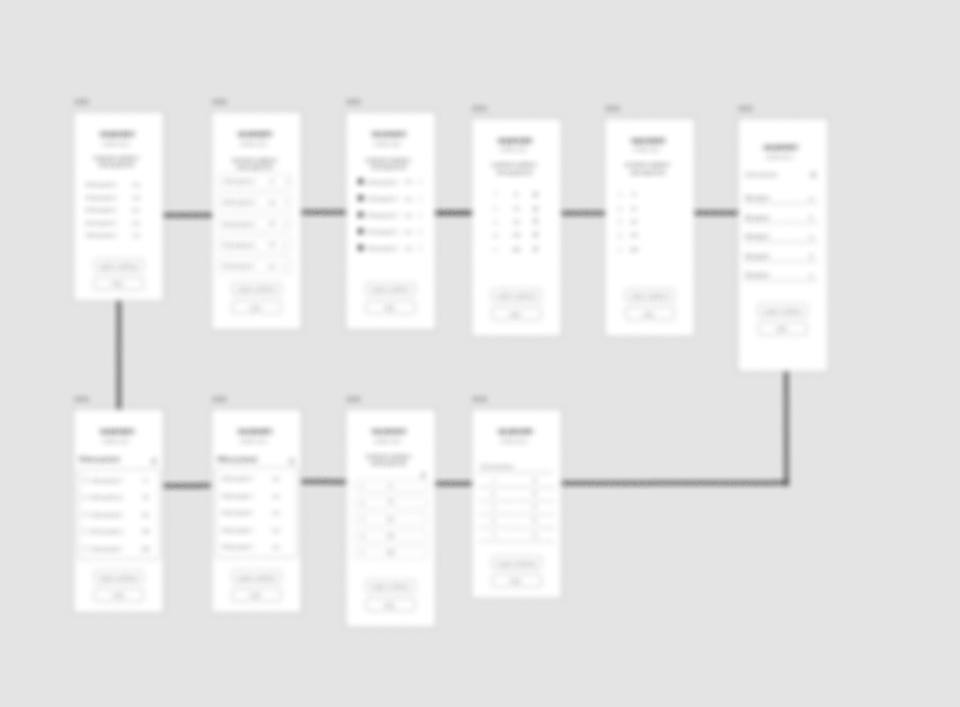
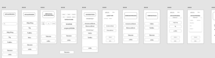
A selection of low-fidelity wireframes from the Adobe XD canvas, used to rapidly explore and discard early ideas.
IMPACT
Reduced the core verification flow from 8 screens to 5 guided steps, cutting repeated choices and manual typing and making progress clearer throughout the task.
This concept supports faster field work and more predictable verification time, which are critical in service and maintenance contexts.
Final impact will be validated later through Kemppi’s implementation and field testing. My contribution focused on research-driven concepting and interaction design, and the work was handed over to the team for further development.
Workflow beats UI. The biggest wins came from merging steps, removing pauses, and making progress obvious — not from styling.
REFLECTION
NEXT TIME
Generate more flow options in week 1–2 (including edge cases).
Align early with engineers on constraints to avoid dead ends.
Present decisions with clearer diagrams and stronger ownership.